
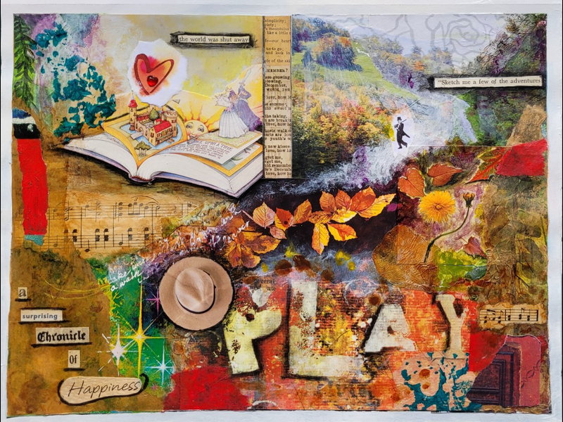

Sometimes when the world seems dark, it helps to chronicle the things that make us happy. They might be little things, but they are warm and important. Although small, they add up to a significance in our lives that must not be taken for granted.
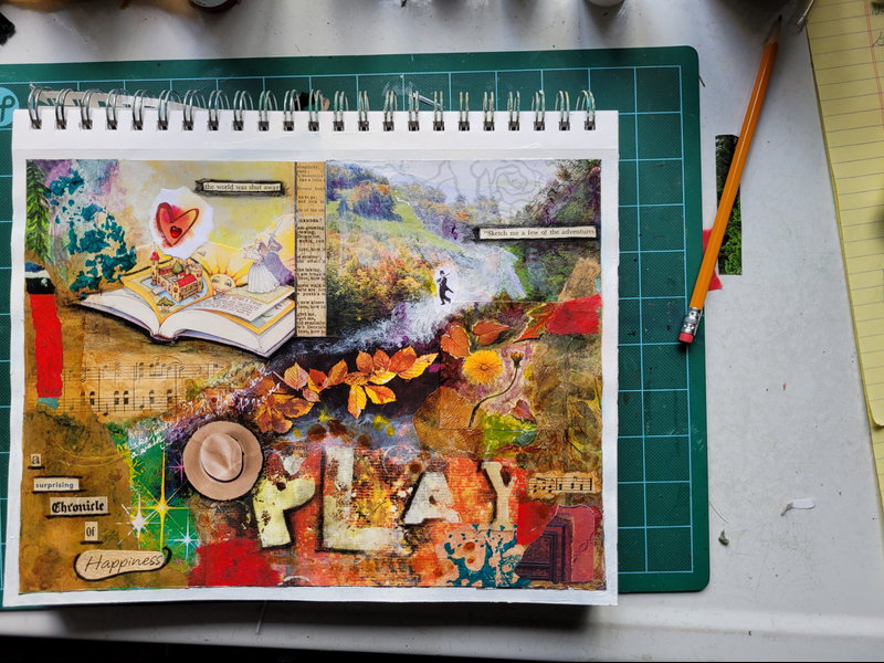
Small significant things were the focus of this mixed-media piece – things that have brought me joy. I wanted to have images of books, old books, children’s books, read-aloud stories; walks in the woods; old movies; sunny hillsides and rolling farmland; night skies; music of all kinds; and dancing, which always means playfulness to me. So the images were a “given” and I set out to find them in my stash of magazines and other papers.
Several mixed media artists whom I admire centre themselves by first writing or “journaling” on the blank page before beginning – sometimes to set an intention or sometimes just to coalesce their thoughts. Not overthinking it, just doing a quick short scribble that will be covered up by the piece itself. So I decided to try it before I glued down any images or background layers. I grabbed a pencil – and was quite surprised to find that I wrote: “In the midst of turmoil and upset, discovery and wonder and constant surprise.” A fitting reminder at this time in our world, and nice to know that it is embedded in this piece.
What colours feel happy to me? I first pictured deep rich jewel tones but while looking for images in those shades, I felt myself intuitively drawn to rainbow hues, and from those into light airy pastels: pinks and turquoise and pale blues. (Balloons and lollipops, anyone?) Green was a constant draw – which made me think of “greenness” – youthfulness – and those walks across fields and through woods. For awhile, there was a lot more green in the four corners of this piece. And I was delighted to find the image of that wonderful expansive green hillside edged by woods and decided to settle it into the top right corner.
But as I was image gathering, my colour attraction morphed again and I found myself constantly drawn to yellow – first sunshine yellow and then autumn yellows. I noticed that the green hillside had a scattering of autumn foliage across it. Autumn colours make me happy. I love how the fallen leaves swirl in lively circles and crunch underfoot and catch the sunlight. Growing up in Muskoka, famous for its fall colour panoramas, I have often collected bright coloured leaves. I have pressed them and put them into books, or I have taped them to a window so sunlight could shine through them like stained glass. On our annual vacation to Nova Scotia’s Eastern Shore, September is always the most beautiful month.
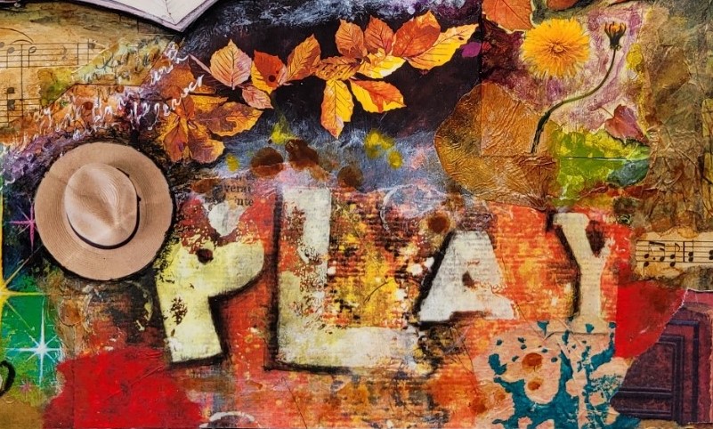
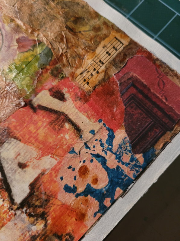
Then the image of “PLAY” showed up in its oranges and yellows and, well, it simply had to be a part of this happy piece. (The Play image is from an artist’s paper offered in Somerset Studio magazine many years ago.) I found frivolity in the actual image of the word “Play” – the serifed “Y” and the suddenly small “A”, the misaligned letters that fairly dance across the page. I was so happy when I found a swath of dancing sunlit autumn leaves to place above it. The messy splotches on “Play” remind me of fooling around with paint, and the circular stains on it bring to mind Happy Hour rings left by coffee cups or beer mugs.
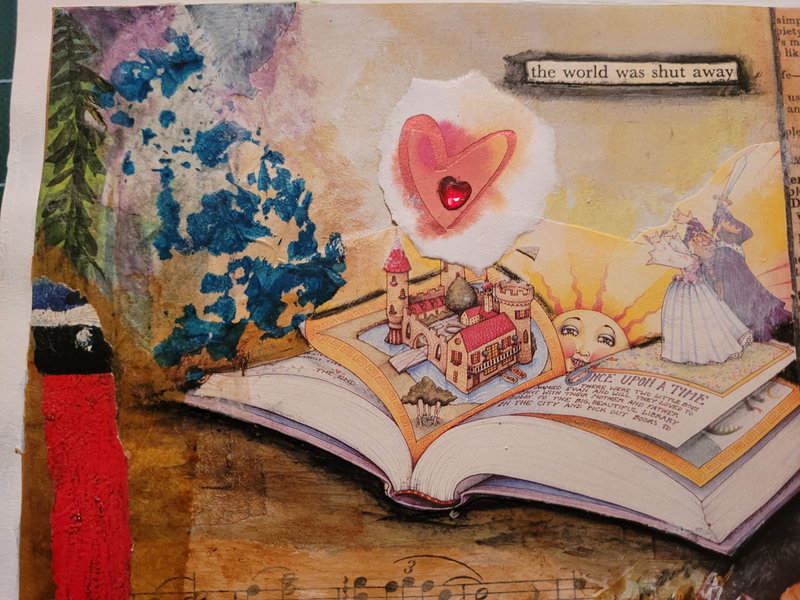
I brought in more yellow with the perfect image of the story book in the upper left, along with yellowed pieces of vintage music. The deep orangey-red of “Play” had brought me back to my original thought of rich jewel tones.
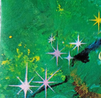
For my “night skies” I found an image of stars in a lushly green night sky. At first, the image took up the entire lower left, just as images of green pines and spruces initially filled the remaining two corners.
But now I ran into trouble. Every corner was Very Busy. And in the middle, there was no quiet space to rest the eye and pull it along, and (equally important to me) there were no spaces for words that I wanted to add! And those stars in their vibrant green sky drew the eye right to them, to the detriment of everything else. (See what I mean?)
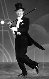
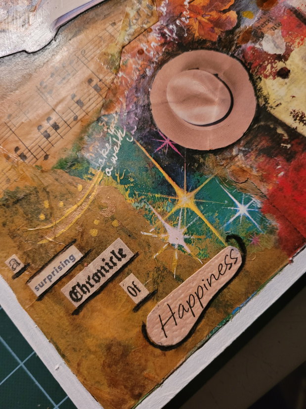
I decided to sleep on it. I don’t know if I dreamt it or what, but next morning, I went right to the studio and tore two pieces of toasty-brown tissue paper and placed one over each of the lower corners. I still had a happy collection of stars showing, and the warm brown stopped the overwhelm-ment. I could suddenly see that the narrow sand hillside trail in the upper right should become a pathway leading broadly up from the dancing leaves – which solved the problem of where I wanted to put my little Fred Astaire figure. (Old movies and dancing, remember?) He needed to dance up and down the hillside!
The music notes were dancing up and down too noticeably, so I subdued them with toasty paint that adds to their already vintage look. I could also see that I needed some reds to reflect that luscious red of the sparkling heart in the upper left. I added bits of red tissue here and there and found an image of an antique book in maroon binding. I put a corner of it down in the lower right.
As for Mr. Astaire, I was unable to find an image of him in my stash, so I went online, found a photo from his movie Top Hat (one of my all-time favorites), digitally cut away all the background, then shrunk the image to the size I needed. I printed it out at a mere three-quarters of an inch high. Here is the original:
Then came the fun part of adding words. Getting lost in a reading adventure was summed up in “the world was shut away”. There are a few bits of journaling done here and there in black and in white that talk about hikes and hillsides and dancing with the leaves of autumn. Inks, some stenciling, and water-soluble pencil added shadows and finishing touches.
I had already settled on A Chronicle of Happiness for the title, but the word “surprising” fits in so nicely, knowing that embedded at the base of this piece are the words, ““In the midst of turmoil and upset, discovery and wonder and constant surprise.”
More Stories
From The Heart
Struck At The Heart
Dream Frame